When styling controls that have a Popup element (e.g. menus, combo boxes, etc.) a common visual cue is a drop-shadow below the pop-up. WPF contains a DropShadowBitmapEffect that will do this all for us, hence,
<Border ...>
<Border.BitmapEffect>
<DropShadowBitmapEffect Softness=".5" ShadowDepth="5" Color="Black"/>
</Border.BitmapEffect>
</Border>
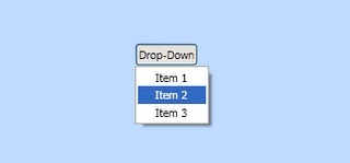
The result is shown on the left below. However, the DropShadowBitmapEffect is a bit overkill for our needs. It is designed to add drop-shadows to arbitrary shapes (for example the text below) whereas a pop-up is generally rectangular.

If you inspect the default WPF styles you will find that a drop shadow is applied via a Decorator called Microsoft.Windows.Themes.SystemDropShadowChrome. This however is hidden away in PresentationFramework.Luna.dll and designed for use by the default styles.
For my controls I have developed my own decorator to do a similar job. Firstly I have decided to make some assumptions to improve performance - namely that the drop-shadow colour is always black, and that it is always to the bottom-right. All that is required then is to implement a custom "Decorator". Decorators are controls that add some additional rendering to a single element (of course that element may be a Panel that contains several other elements). We can then draw a drop-shadow in the OnRender method consisting of a set of linear and radial gradients to mimic the shadow.
using System;
using System.Collections.Generic;
using System.Text;
using System.Windows.Controls;
using System.Windows.Media;
using System.Windows
class ShadowChrome : Decorator
{
// *** Fields ***
private static SolidColorBrush backgroundBrush;
private static LinearGradientBrush rightBrush;
private static LinearGradientBrush bottomBrush;
private static RadialGradientBrush bottomRightBrush;
private static RadialGradientBrush topRightBrush;
private static RadialGradientBrush bottomLeftBrush;
// *** Constructors ***
static ShadowChrome()
{
MarginProperty.OverrideMetadata(typeof(ShadowChrome), new FrameworkPropertyMetadata(new Thickness(0, 0, 4, 4)));
CreateBrushes();
}
// *** Overriden base methods ***
protected override void OnRender(DrawingContext drawingContext)
{
// Calculate the size of the shadow
double shadowSize = Math.Min(Margin.Right, Margin.Bottom);
// If there is no shadow, or it is bigger than the size of the child, then just return
if (shadowSize <= 0 || this.ActualWidth < shadowSize*2 || this.ActualHeight < shadowSize * 2)
return;
// Draw the background (this may show through rounded corners of the child object)
Rect backgroundRect = new Rect(shadowSize, shadowSize, this.ActualWidth - shadowSize, this.ActualHeight - shadowSize);
drawingContext.DrawRectangle(backgroundBrush, null, backgroundRect);
// Now draw the shadow gradients
Rect topRightRect = new Rect(this.ActualWidth, shadowSize, shadowSize, shadowSize);
drawingContext.DrawRectangle(topRightBrush, null, topRightRect);
Rect rightRect = new Rect(this.ActualWidth, shadowSize * 2, shadowSize, this.ActualHeight - shadowSize * 2);
drawingContext.DrawRectangle(rightBrush, null, rightRect);
Rect bottomRightRect = new Rect(this.ActualWidth, this.ActualHeight, shadowSize, shadowSize);
drawingContext.DrawRectangle(bottomRightBrush, null, bottomRightRect);
Rect bottomRect = new Rect(shadowSize * 2, this.ActualHeight, this.ActualWidth - shadowSize * 2, shadowSize);
drawingContext.DrawRectangle(bottomBrush, null, bottomRect);
Rect bottomLeftRect = new Rect(shadowSize, this.ActualHeight, shadowSize, shadowSize);
drawingContext.DrawRectangle(bottomLeftBrush, null, bottomLeftRect);
}
// *** Private static methods ***
private static void CreateBrushes()
{
// Get the colors for the shadow
Color shadowColor = Color.FromArgb(128, 0, 0, 0);
Color transparentColor = Color.FromArgb(16, 0, 0, 0);
// Create a GradientStopCollection from these
GradientStopCollection gradient = new GradientStopCollection(2);
gradient.Add(new GradientStop(shadowColor, 0.5));
gradient.Add(new GradientStop(transparentColor, 1.0));
// Create the background brush
backgroundBrush = new SolidColorBrush(shadowColor);
// Create the LinearGradientBrushes
rightBrush = new LinearGradientBrush(gradient, new Point(0.0, 0.0), new Point(1.0, 0.0));
bottomBrush = new LinearGradientBrush(gradient, new Point(0.0, 0.0), new Point(0.0, 1.0));
// Create the RadialGradientBrushes
bottomRightBrush = new RadialGradientBrush(gradient);
bottomRightBrush.GradientOrigin = new Point(0.0, 0.0);
bottomRightBrush.Center = new Point(0.0, 0.0);
bottomRightBrush.RadiusX = 1.0;
bottomRightBrush.RadiusY = 1.0;
topRightBrush = new RadialGradientBrush(gradient);
topRightBrush.GradientOrigin = new Point(0.0, 1.0);
topRightBrush.Center = new Point(0.0, 1.0);
topRightBrush.RadiusX = 1.0;
topRightBrush.RadiusY = 1.0;
bottomLeftBrush = new RadialGradientBrush(gradient);
bottomLeftBrush.GradientOrigin = new Point(1.0, 0.0);
bottomLeftBrush.Center = new Point(1.0, 0.0);
bottomLeftBrush.RadiusX = 1.0;
bottomLeftBrush.RadiusY = 1.0;
}
}
This may then be used as shown in the following XAML. Note that the Margin property is used for two uses. Firstly it provides an area around the element to render the drop-shadow (this is important in a Popup since it ensures the drop-shadow is within the pop-up window), and also specifies to ShadowChrome the size to render the drop-shadow.
<ShadowChrome>
<Border Margin="0,0,5,5" .../>
</ShadowChrome>
